
짜리몽땅 매거진
[Python] 데이터에서의 Outlier 처리 본문
데이터 전처리에는 여러 과정이 포함되지만, 그 중에서도 이상치(Outlier) 처리는 매우 중요한 단계이다. 이상치란 일반적인 데이터 패턴에서 벗어난 값으로, 종종 잘못된 데이터 입력이나 측정 오류로 인해 발생한다. 이상치 처리는 데이터 분석 결과의 신뢰성을 높이고 모델 성능을 향상시키는 데 도움을 준다.
0. 이상치 처리 방법
- 이상치 탐색: 가장 먼저 해야 할 작업은 데이터에서 이상치를 탐색하는 것이다. 상자 그림(box plot)이나 히스토그램(histogam) 등의 시각화 도구를 사용하여 데이터의 분포를 확인하고 이상치를 찾을 수 있다.
- 이상치 제거: 이상치를 발견했다면, 해당 이상치를 제거하는 것이 일반적이다. 이 단계에서는 이상치가 잘못된 데이터 입력이나 측정 오류로 인해 발생한 것인지 확인해야 한다. 이상치가 잘못된 데이터로 인해 발생한 경우, 해당 데이터를 삭제하거나 수정할 수 있다.
- 이상치 대체: 이상치를 제거하기 어려운 경우, 이상치를 대체하는 것이 좋을 수 있다. 가장 일반적인 방법은 평균값, 중앙값, 최빈값 등으로 이상치를 대체하는 것이다. 다른 방법으로는 회귀 분석을 사용하여 다른 변수들 사이의 관계를 고려하여 이상치를 대체하는 것이 있다.
1. IQR 방법을 이용한 이상치 조절
※ 'heart_2020_cleaned.csv' 샘플데이터를 활용해 이상치 처리 실습을 진행하였다.

#Q1 Q2의 값을 만들기
Q1 = df_1['BMI'].quantile(0.25)
Q3 = df_1['BMI'].quantile(0.75)

#IQR 만들기! Q3-Q1
IQR = Q3- Q1

# 이상치 범위 조절
out_range=1.5

#이상치 범위 설정
outlier_range=(df_1['BMI'] >= Q1-out_range*IQR) & (df_1['BMI']<= Q3+ out_range*IQR)

#이상치범위 데이터를 loc을 이용해서 접근
df_rmv = df_1.loc[outlier_range]

# BMI 박스플롯 시각화
plt.figure(figsize=(10,7))
sns.boxplot(y='BMI', data= df_rmv)
plt.show()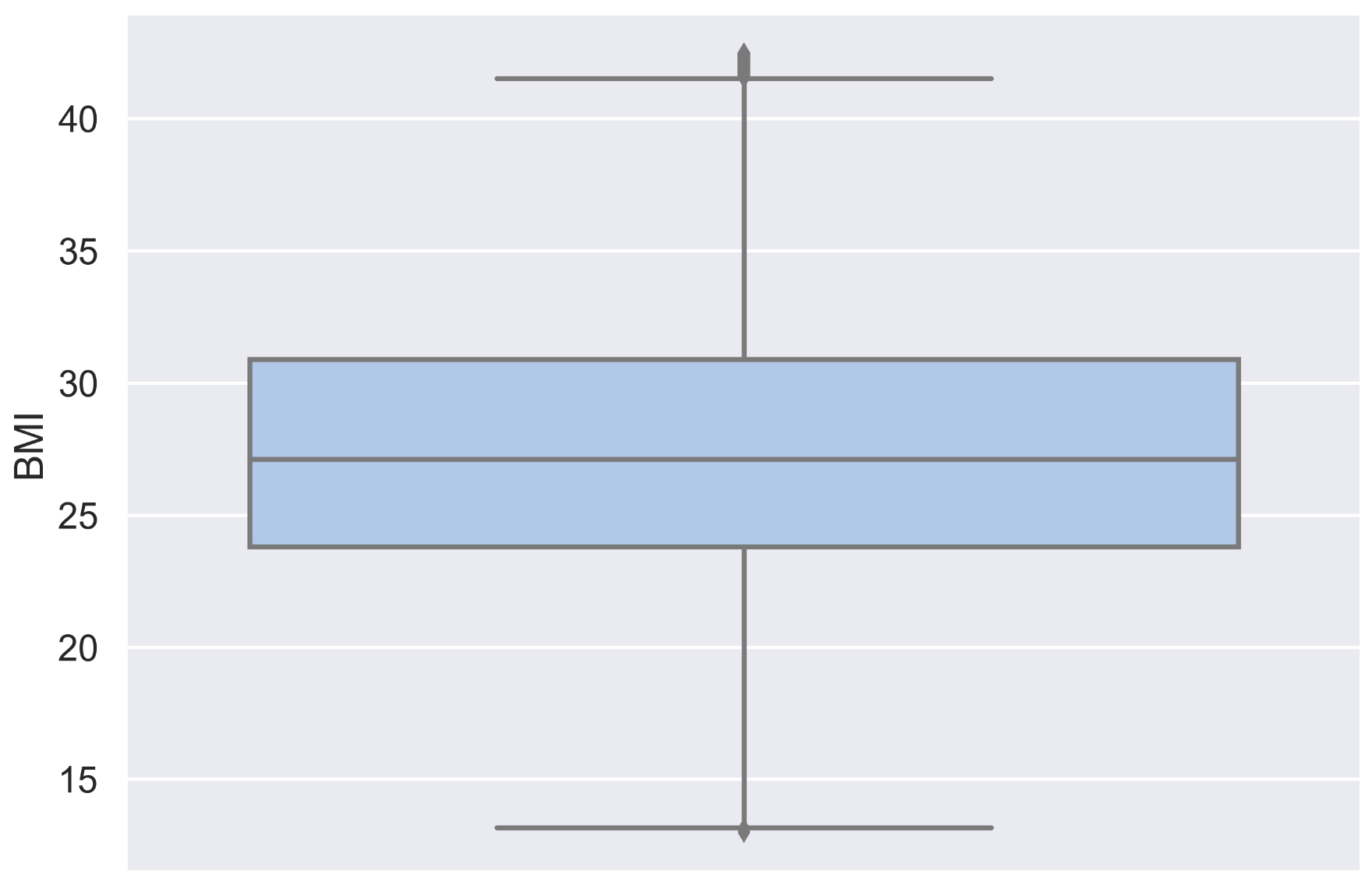
2. Standard Deviation Method
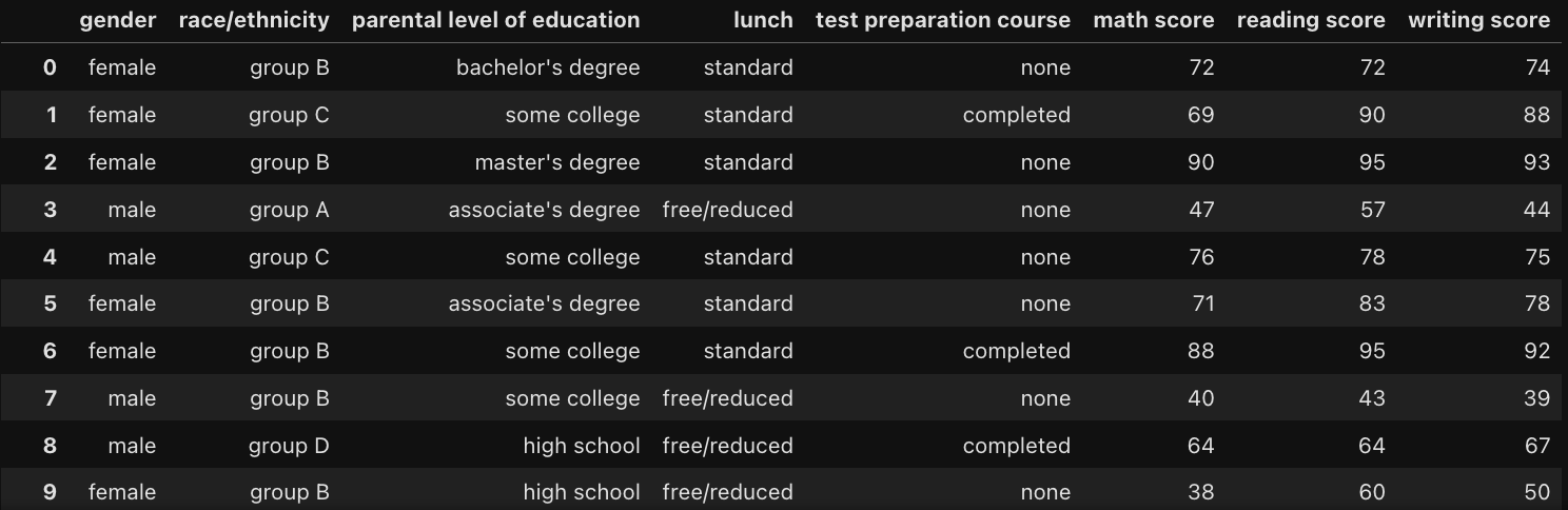
※ 'StudentsPerformance.csv' 샘플데이터를 활용해 이상치 처리 실습을 진행하였다.
def out_std(df, column):
    global lower, upper #전역 변수로 lower와 upper 지정
    data_mean, data_std = df[column].mean(), df[column].std()

    # 표준편차에 얼마 범위만큼 가지고 가고 나머지를 제거할 것인지
    # 값은 원하는 만큼 조정

    cut_off = data_std *3
    # 평균에 빼고 더해서 , 범위 정하기
    lower, upper = data_mean - cut_off, data_mean +cut_off
    print('lower',lower)
    print('upper',upper)

    df1 = df[df[column]>upper]
    df2 = df[df[column]<lower]

    return print('Outlier', df1.shape[0] + df2.shape[0])
(Outlier 데이터 확인)
plt.figure(figsize=(10,5))
sns.distplot(df_2['writing score'], kde=False)
plt.axvspan(xmin = lower, xmax = df_2['writing score'].min(), alpha=0.2, color='red')
plt.axvspan(xmin = upper, xmax = df_2['writing score'].max(), alpha=0.2, color='red')
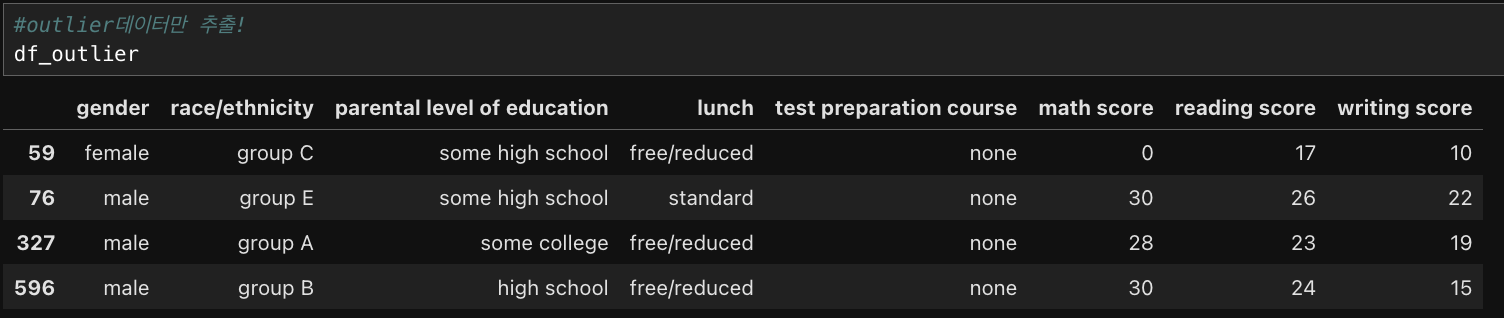
# outlier data
df_outlier = df_2[(df_2['writing score']>upper) | (df_2['writing score']< lower)]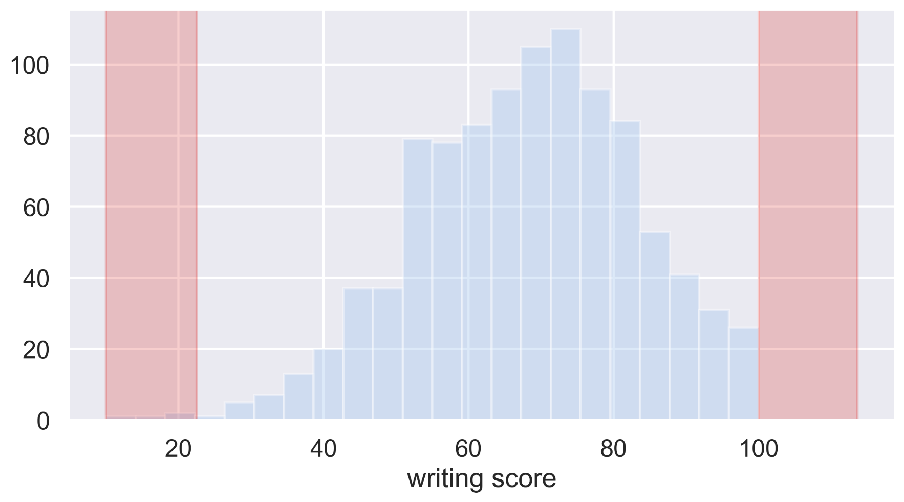
3. Z-score method
※ 'insurance 2.csv' 샘플데이터를 활용해 이상치 처리 실습을 진행하였다.

Z-score 란? : (Xi-mean)/starndard deviation)
def out_zscore(data):
    global outliers, zscore

    #outlier 변수 담기
    outliers =[]
    zscore= []

    #평균, 분산, threshold 를 지정
    threshold = 2
    mean = np.mean(data)
    std = np.std(data)

    for i in data:
        z_score = (i- mean)/std
        zscore.append(z_score)
        if np.abs(z_score)> threshold:
            outliers.append(i)

    return print('Outlier', len(outliers))
(Outlier 데이터 확인)
plt.figure(figsize=(10,5))
sns.distplot(zscore)
plt.axvspan(xmin = 3, xmax = max(zscore), alpha=0.2, color='red')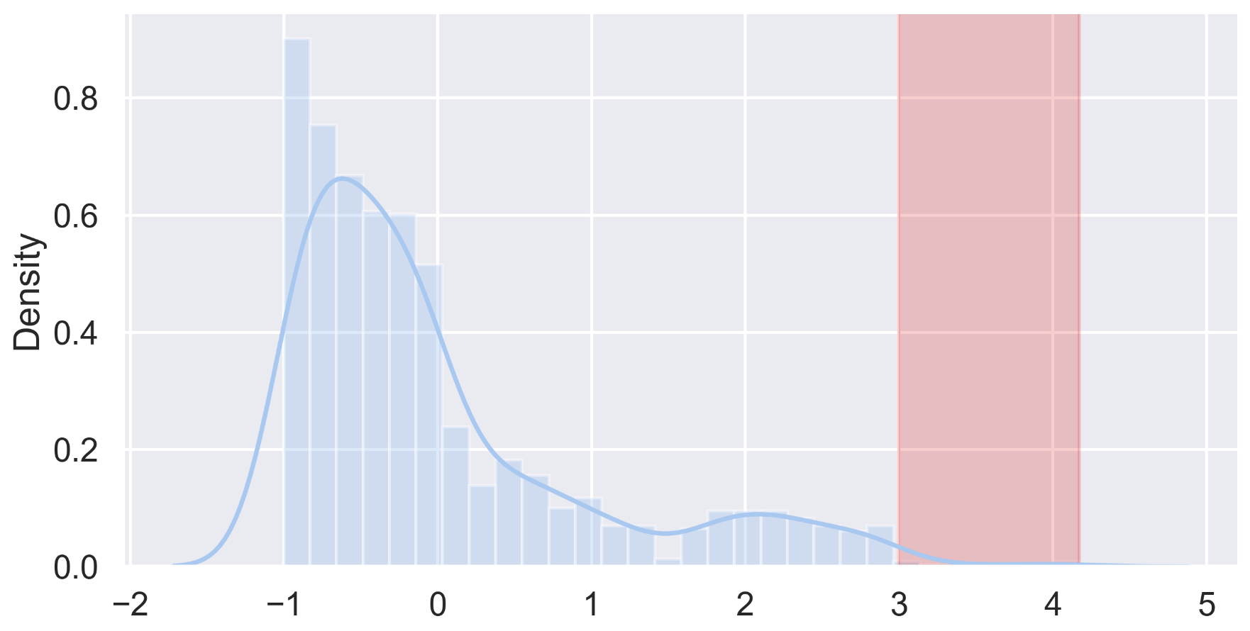
4. Isolation Forest
※ 'StudentsPerformance.csv' 샘플데이터를 활용해 이상치 처리 실습을 진행하였다.
<isolation forest 알고리즘을 활용한 이상치 처리 구조>
- 이상치는 잘게 나눠서 분할을 하면 몇 개 분할하지 않아도 고립될 것이다. 이상치만 따로 빠지게 될 것.
- itree 여러 번 반복 진행하여 scoring을 계산한다.
- 트리를 나눠서 생각하면 이상치가 아닌 것들은 트리가 길어진다. 이상치는 트리가 깊지 않을 것.
- 전체 평균의 길이와 비교하여 이상치길이 와 평균치 길이를 토대로 scoring 진행
- 0~1 사이에 대한 분포 값으로 만들어지고, 1에 가까우면 이상치 가능성 높고 0.5 이하 정상데이터로 판별
cols = ['writing score','reading score','math score']

# 그래프를 그리기 위해서 subplot 생성
fig, axs = plt.subplots(1,3, figsize=(20,5), facecolor= 'w', edgecolor='k')
axs = axs.ravel()

# 반복문을 통해 그래프 그리기
for i, column in enumerate(cols):
    isoltaion_forest = IsolationForest(contamination='auto') # 패키지 import
    isoltaion_forest.fit(df_2[column].values.reshape(-1,1)) #반복문을 이용해서 해당 값을 행렬 조정하여 fit

    xx = np.linspace(df_2[column].min(), df_2[column].max(), len(df_2)).reshape(-1,1) # 학습에 최대 최솟값 범위 지정
    anomaly_score = isoltaion_forest.decision_function(xx) #이상치에 대한 범위 값을 넣어서 탐색 예정
    outlier = isoltaion_forest.predict(xx) # outlier에 대한 값을 예측

    axs[i].plot(xx, anomaly_score, label='anomaly score') #이상치 점수 그래프 그리기
    axs[i].fill_between(xx.T[0], np.min(anomaly_score), np.max(anomaly_score),
                       where =outlier== -1, color='r', alpha=0.5, label='outlier region') #이상치 구간을 지정하는 그래프
    axs[i].legend()
    axs[i].set_title(column)
    print(anomaly_score,'이상치 점수')
print(outlier, 'outlier')'Data > Python' 카테고리의 다른 글
| [Python] 네이버 뉴스기사 크롤링하고 감성분석하기 (0) | 2024.06.25 |
|---|---|
| [Python] selenium으로 워크넷 동적 크롤링하기 (0) | 2024.04.15 |
| [Python] beautifulsoap으로 당근마켓 정적 크롤링하기 (0) | 2024.04.14 |
| [Python] 데이터에서의 Missing Value 처리 (0) | 2024.03.29 |
| [Python] 마켓컬리 리뷰 전처리, 워드클라우드 시각화 (1) | 2023.12.29 |

